
Testing Decision Support
Role: Design lead | Team 1 Product manager, 1 engineer, 1 data insights engineer, 1 clinical lead | Timeline:January 2024-present | Where we are now: Preparing to launch to our first wave of beta practices
The Right test for the right patient at the right time
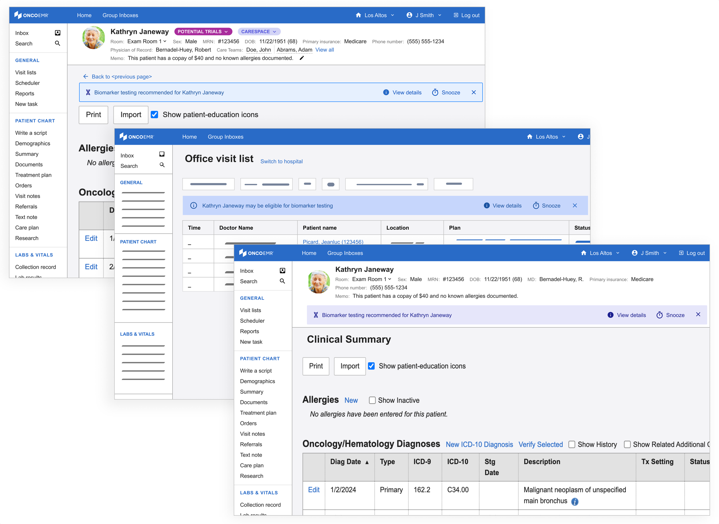
The Testing Decision Support (TDS) solution is a point-of-care intervention embedded in OncoEMR, Flatiron Health's flagship oncology-specific electronic medical records product. The tool analyzes patient data to alert oncology providers when a patient may be eligible for molecular profiling testing, a critical step in identifying targeted treatments that can significantly improve length and quality of life for cancer patients.
I led UX strategy, research, and design for this project from early discovery through a six-month pilot across 18 oncology practices. The pilot launched in April 2025 and resulted in a 16.28% increase in testing rates over baseline and an estimated 99 additional patients receiving testing they may not have otherwise.
Curiosity
Testing Rates are falling behind
In precision oncology medicine, molecular profiling testing reveals genetic abnormalities that guide targeted therapies, helping doctors choose treatments with the highest potential for patient success. However, research from within Flatiron Health’s broad network of practices suggests that not all eligible patients are being tested in accordance with National Comprehensive Cancer Network (NCCN) recommendations.
This trend is particularly stark in smaller community oncology practices, where most Americans are treated. One disease that exemplifies this gap is early stage non-small cell lung cancer (eNSCLC), where according to data from within Flatiron's network, testing rates for appropriate biomarkers is at about ~64%. Because of this trend, our team decided to focus our efforts on raising eNSCLC rates for the pilot.
Research
Discovery
Before beginning the design process, I wanted to talk to more of our providers. If doctors were aware that testing could lead to better treatment, why were they letting the opportunity slip through the cracks? After an analysis of previous conversations conducted with providers that use Flatiron’s products in 2018 and 2020, I built a research plan to help us fill in the gaps. I found that while the landscape of testing changes rapidly year over year, many of the same themes persisted.
Participants | 5 internal Flatiron clinical team members, 5 doctors from practices within our network (multi-specialty)
Timeline | March-April 2022
Insights
-
All the clinicians we spoke to agree that some cases are very clear cut, but each cancer patient is unique and at a unique stage in their journey. While clinicians rely heavily on guidelines to order tests, these guidelines are constantly evolving and can be hard to apply in some cases
-
Clinicians at small practices who see many different types of cancer and have limited resources don't have access to some of the support that doctors at larger practices do. Without stronger practice-wide processes or support structured for clinicians in place, some eligible patients may fall through the cracks
-
Running a test takes time. When a sick patient walks into a clinic, doctors are motivated to get them treated promptly, which often means traditional methods like chemo or radiation. As a result, providers may miss the optimal testing window.
-
Practices reported struggling to understand whether a test was going to be covered and ultimately having the patient opt out due to the uncertainty. The last thing a provider wants is for their patient to get stuck with a bill on top of a terrible diagnosis.
What users said
“It’s a pain point for me, I’m a generalist [...] there needs to be a solution that has some kind of computer-aided support.”
“In adult oncology we treat so many medicare patients. The big question is always- will it be covered?”
“I do not believe that the NCCN guidelines are good enough for what we need to see for molecular testing”
Best practices for designing at the point of care
Because this solution was going to be deployed in Flatiron's flagship electronic medical records product, OncoEMR, I also wanted to incorporate these insights into existing design principles. These principles coalesced as a result of consistent clinician feedback about point-of-care solutions.

Don't block the clinician's workflow unless it's absolutely necessary
"Don't interrupt my processes unless there's a risk to my patient!"
Keep information brief, direct and to the point
"I don't have time to read mountains of text. Give me the important information first."

Put information in places providers already are
"I don't want to be running around to different pages and workflows constantly. I want everything at my fingertips when I'm working."

Minimize friction, maximize engagement
"Some of these workflows already have too many clicks. It drives me crazy."
Be transparent and clear with all clinical information
"I want the information presented to be in clear terms so that I can interpret it without extra effort."
Creativity
To start, I explored a range of options in highly trafficked pages in OncoEMR and plotted them against expected technical lift and the amount of interruption they would impose on the provider's workflow. Ideally, we wanted a solution that was a moderate to low technical lift and interruption.
Some initial feedback from our users highlighted clear winners from the initial exploration as well as some additional directions to try:
• Providers liked the idea of a badge in the list of upcoming visits and the header of each patient's chart, but some worried that it would get lost in the shuffle or that they might experience 'badge fatigue' given that it would be one of multiple badges a patient might have
• As we predicted, providers had no interest in a popup interrupting their workflow, but recognized that it would certainly make them have to pay attention to the information
• Providers liked the genomics page idea but were skeptical as to whether or not they'd actually remember to visit it during their busy day
• Highlights and messages in the list of upcoming visits and 'treatment plan' were noticeable and timely, but providers worried that they weren't quite appearing in the right place at the right time
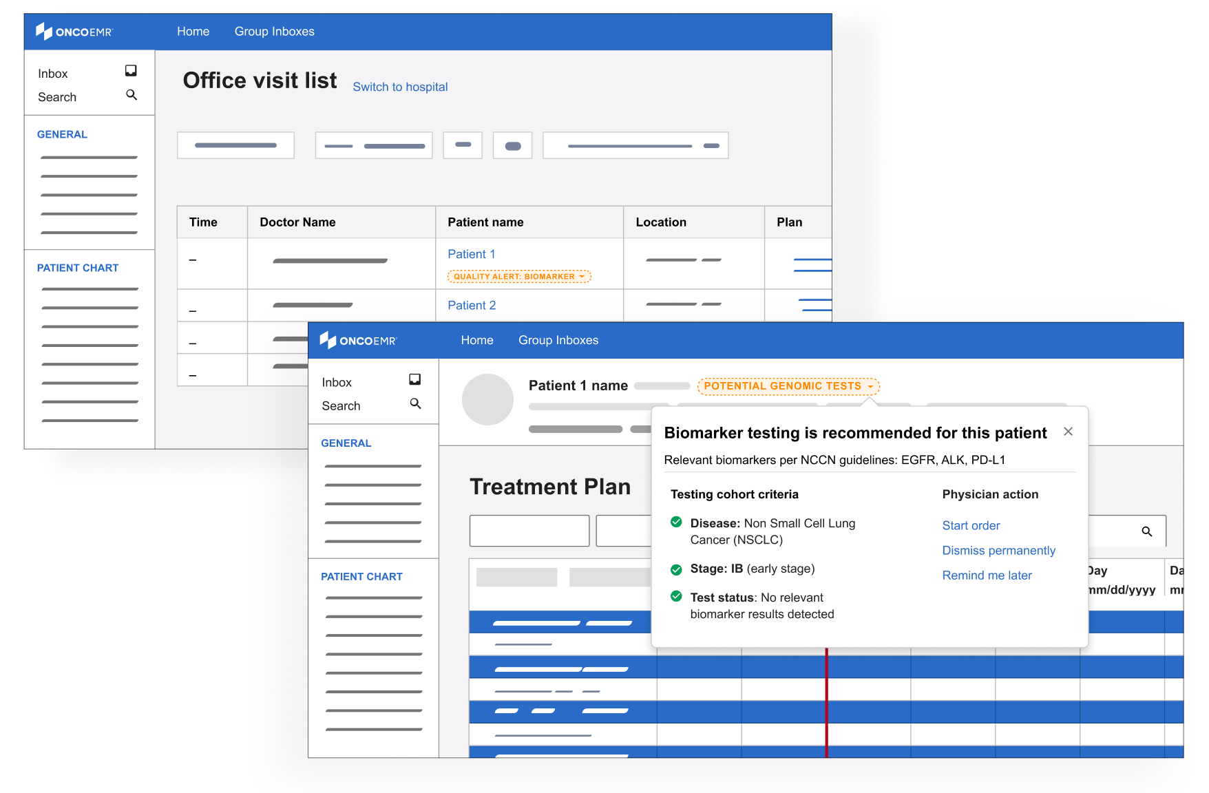
Based on this feedback, I doubled down on the badge exploration which seemed best positioned to deliver the right information at the right time without being overly annoying. I also started to explore a solution in the ‘diagnosis and staging workflow,’ where providers classify the cancer type and severity for their patient.
Badges
Deeper explorations of the badge concept with louder colors and the ability see more details about eligibility via a clickable dropdown
Diagnosis & staging
A subtle badge or highlighted ‘alert’ in the workflow where providers diagnose a patient
Information about genomic testing eligibility that appears as the provider is staging the patient’s cancer
A final round of feedback with some users from other places in our practices confirmed that we were honing in on the right pattern:
• Providers liked seeing more information about eligibility incorporated in the alert
• Providers liked the idea of being alerted when they were looking at the patient's diagnosis and stage because it catches them closer to the moment when they would be able to act on the information
• Providers liked seeing information that was prominent but not blocking
Renewed focus
After our final round of testing, the testing decision support work was paused for about a year while the team refocused on higher priority work. In 2024, the company re-prioritized the project with a devoted scrum team. I took on the role of lead designer and used my institutional knowledge of our previous work to explore how we should proceed with more resourcing.
Demoting the badge
Since the badge was our last most promising direction, product was deeply interested in doubling down on this pattern in OncoEMR. I had two concerns with the badge:
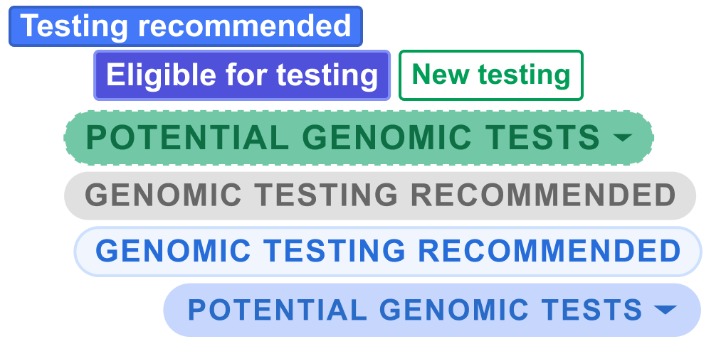
• Badge fatigue: A number of workflows were trying to make use of the badge pattern, meaning a patient may have up to 5 visible at a time. This creates 'badge fatigue' in providers, who end up ignoring these colorful indicators altogether
• Mixed signals: As different teams looked to the badge to solve disparate problems, the role of the badge was being muddled. Was it intended to indicate a status? Provide an alert? Impart additional information? I was hesitant to further stretch our design system around this new use case
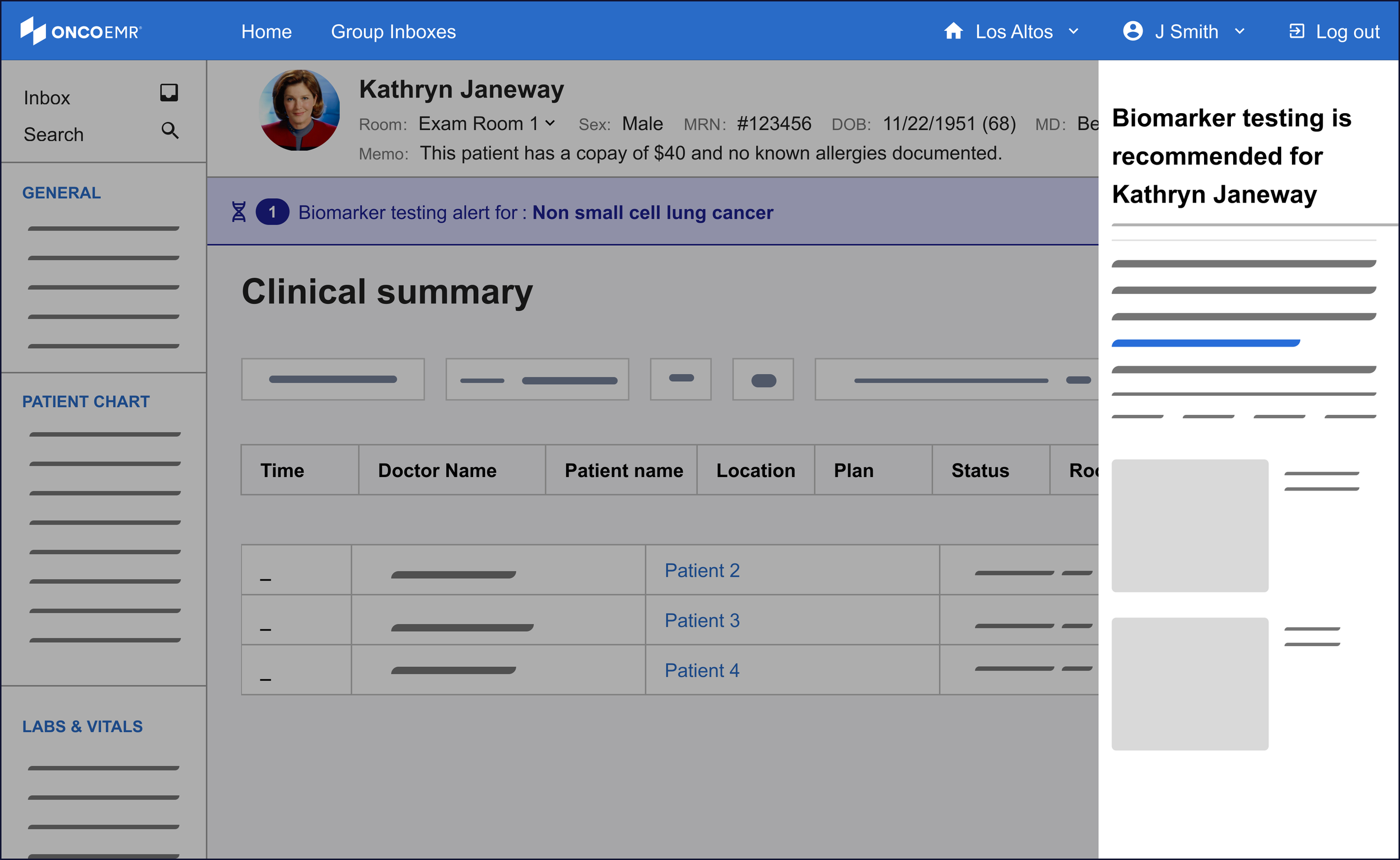
Instead, I started to explore designs that leveraged the energy of the badge while not sacrificing prominence and clarity. This is how I began using the banner motif.
Introducing the banner
My initial exploration in this space leveraged an existing pattern in our design system, the "callout." This is often used as an embedded popup in different parts of the patient's chart for contextual alerts. In order to leverage what worked about the badge, I kept these alerts close to the patient chart header.
However, not unlike the popups, these striding alerts felt too heavy for what we were trying to achieve.
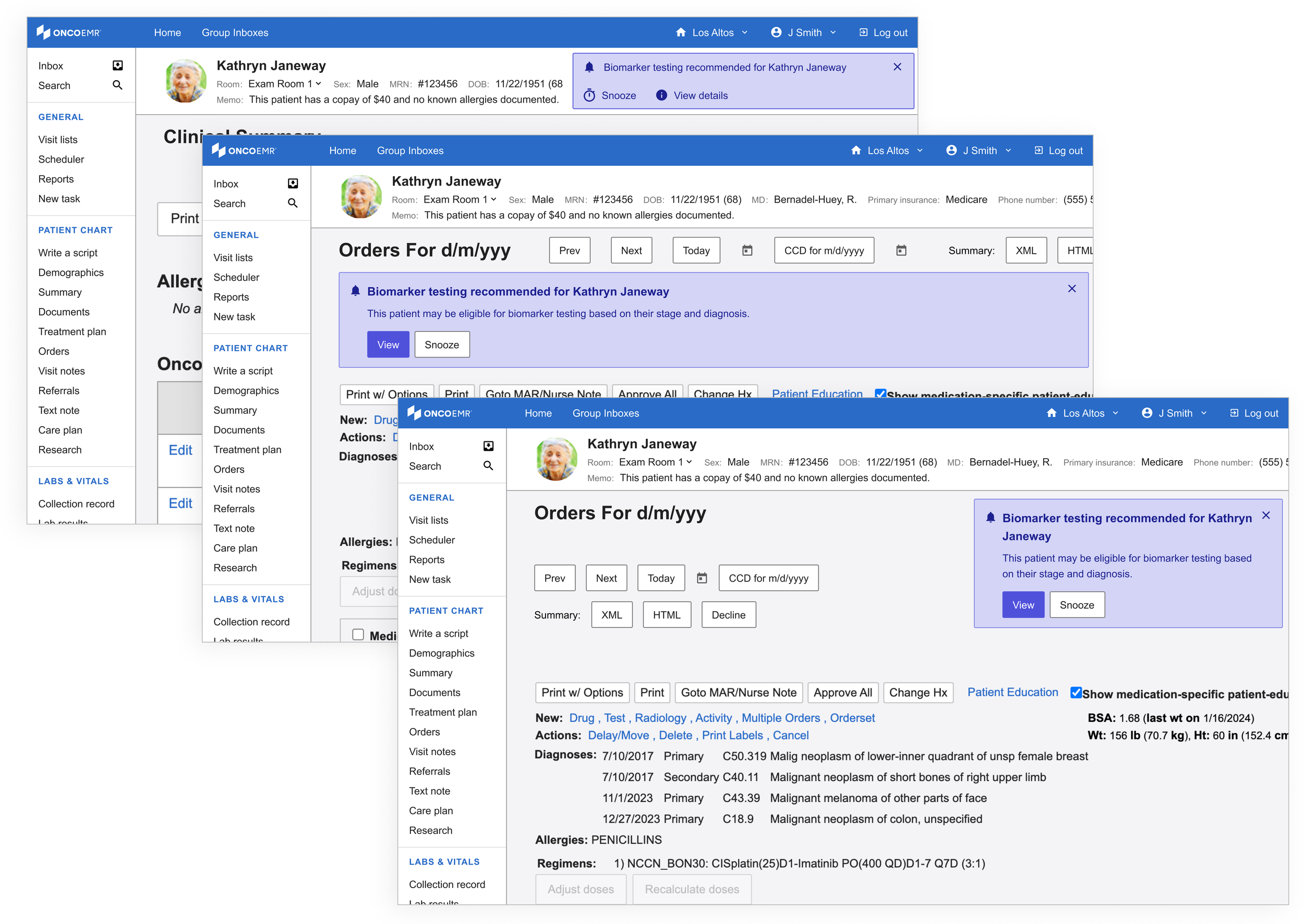
Using the same patterns, I started to explore a lighter variation. I called these the 'alert banner.' Not only did these feel like they had the appropriate amount of attention-grabbing capacity, they had the potential to be scaled to more than one alert or exist across multiple pages.
Refining
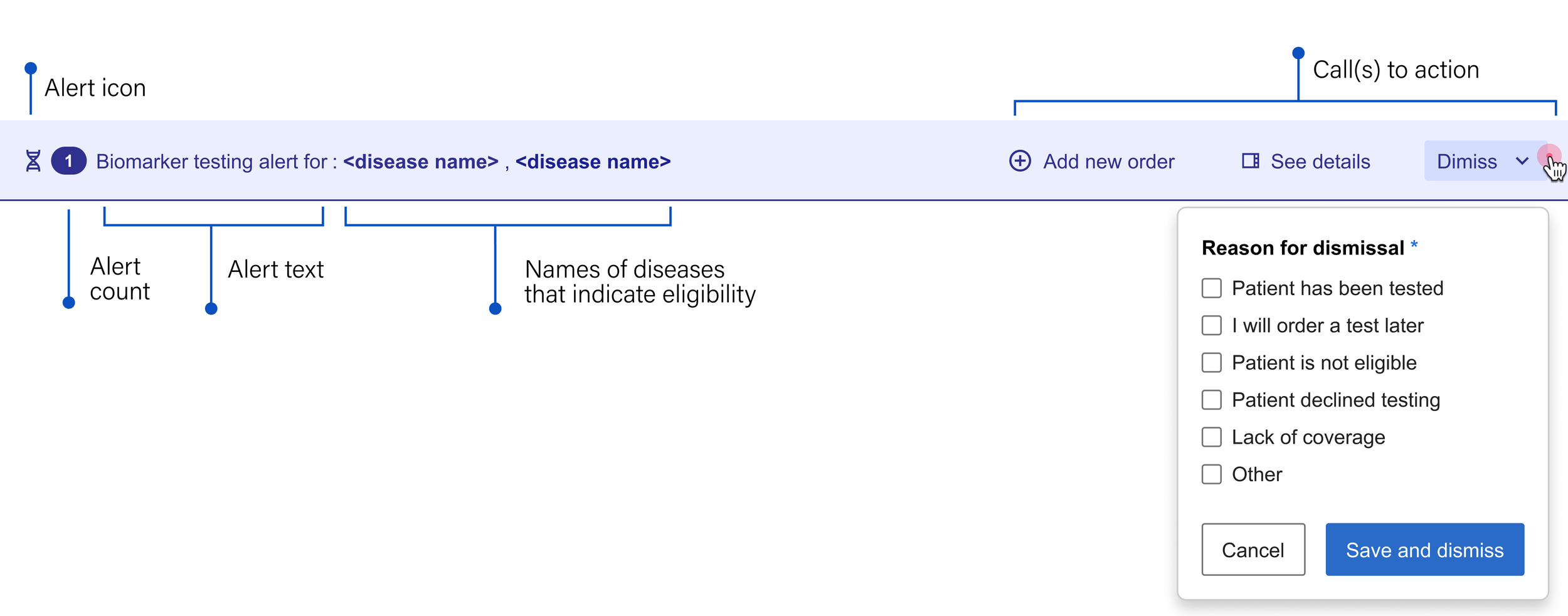
Anatomy of the alert banner
I deconstructed the alert banner's structure to determine how it could best guide providers from notification to action. By breaking down its essential elements, our team could decide which specific workflows the component should enable.
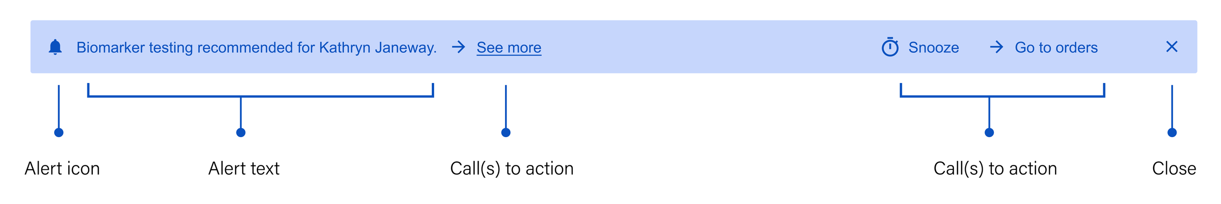
Alert icon: Something unique that immediately indicates the nature of the message
Alert text: Short, generalized and to the point, both saving space and encouraging the user to seek more information
Call(s) to action: Gives the user options about what they can do next
See more: Leads the user to more detailed information about the recommendation so they can make an informed decision
Snooze: Temporarily dismisses the alert so the provider can focus on other things until they're ready to acknowledge the information
Go to orders: Takes the user directly to the workflow that allows them to add a molecular profiling test
Close: Permanently dismisses the alert
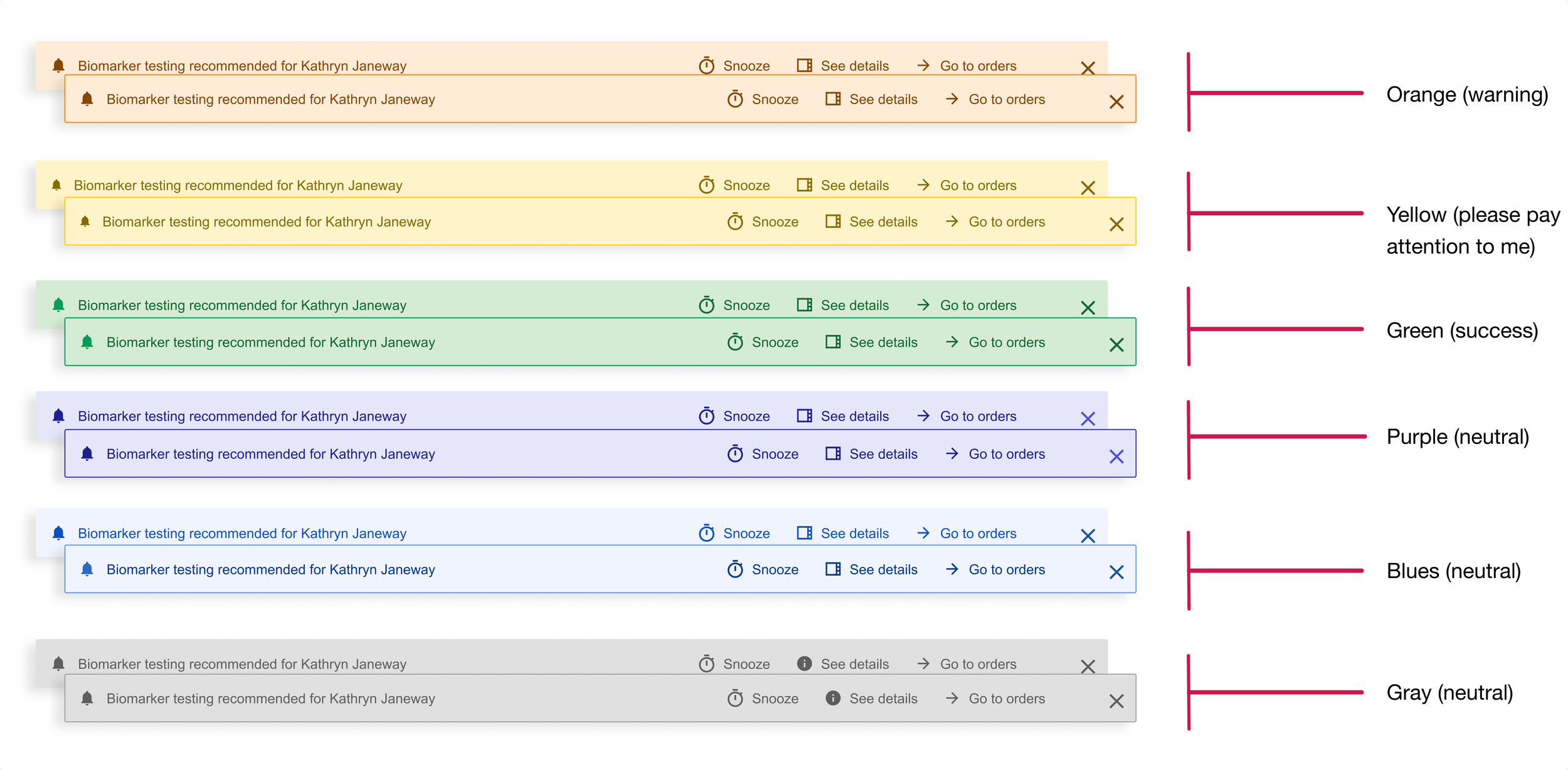
Exploring color
Equally important for the purposes of alerting in a medical context is color. In OncoEMR (as is true in many other EMRs), red is reserved for severe patient safety alerts and orange is used to issue a warning or message the provider should not ignore before moving on. While not expressing as much urgency, yellow is also on the warning spectrum. Below is a breakdown of how the colors in our design system are intended to communicate with the user.
Calls to action
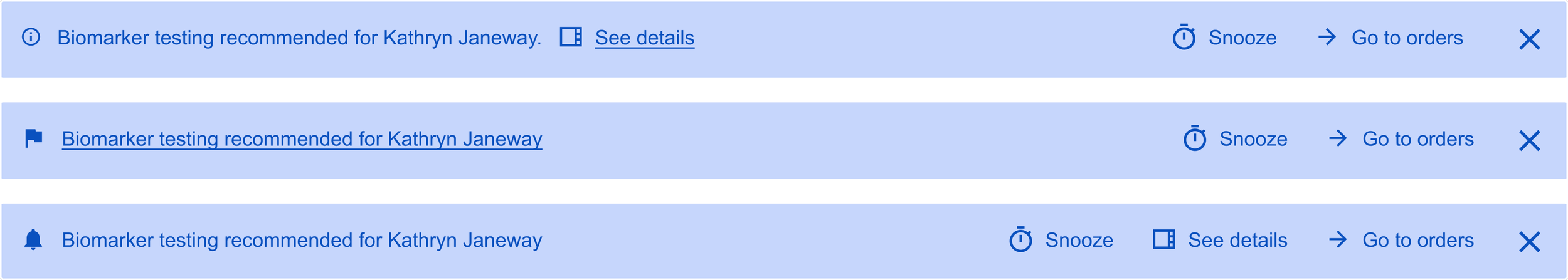
I tried a few different configurations for where the links to these actions should appear on the banner. My most successful iteration separated the actions from the alert text: Because each potential action might have equal importance to the user depending on the scenario, it made the most sense to cluster them so that the provider could see all their options at once.
Finalizing the alert banner
The final version of the banner alert included two additional elements:
• Alert count: In order to account for the fact that one patient may be eligible for more than one kind of testing
• Dismiss: Rather than allowing the user to close out of the alert without addressing it, we wanted to be able to collect the reason for dismissal. To lighten the load, we made this a multiple choice option and surfaced the most common reasons for dismissal that we heard in our interviews. Not only does this give our team feedback on how well the alert is working, it also helps us gather data to better understand how providers make decisions when it comes to these tests.
Exploring color (cont)
While the testing decision support alert is just that, an alert, the provider can safely ignore it without causing immediate patient harm. Not wanting to dilute the meaning of more severe alerts, I anchored to the more neutral color options. Purple emerged as the most logical choice here for two reasons: (1) OncoEMR uses blue as an accent color, and I feared the alert might get lost. (2) gray is used in other places in the EMR to indicate a disabled state. I wanted the alert to pop just enough to catch the user's eye without being an eyesore.
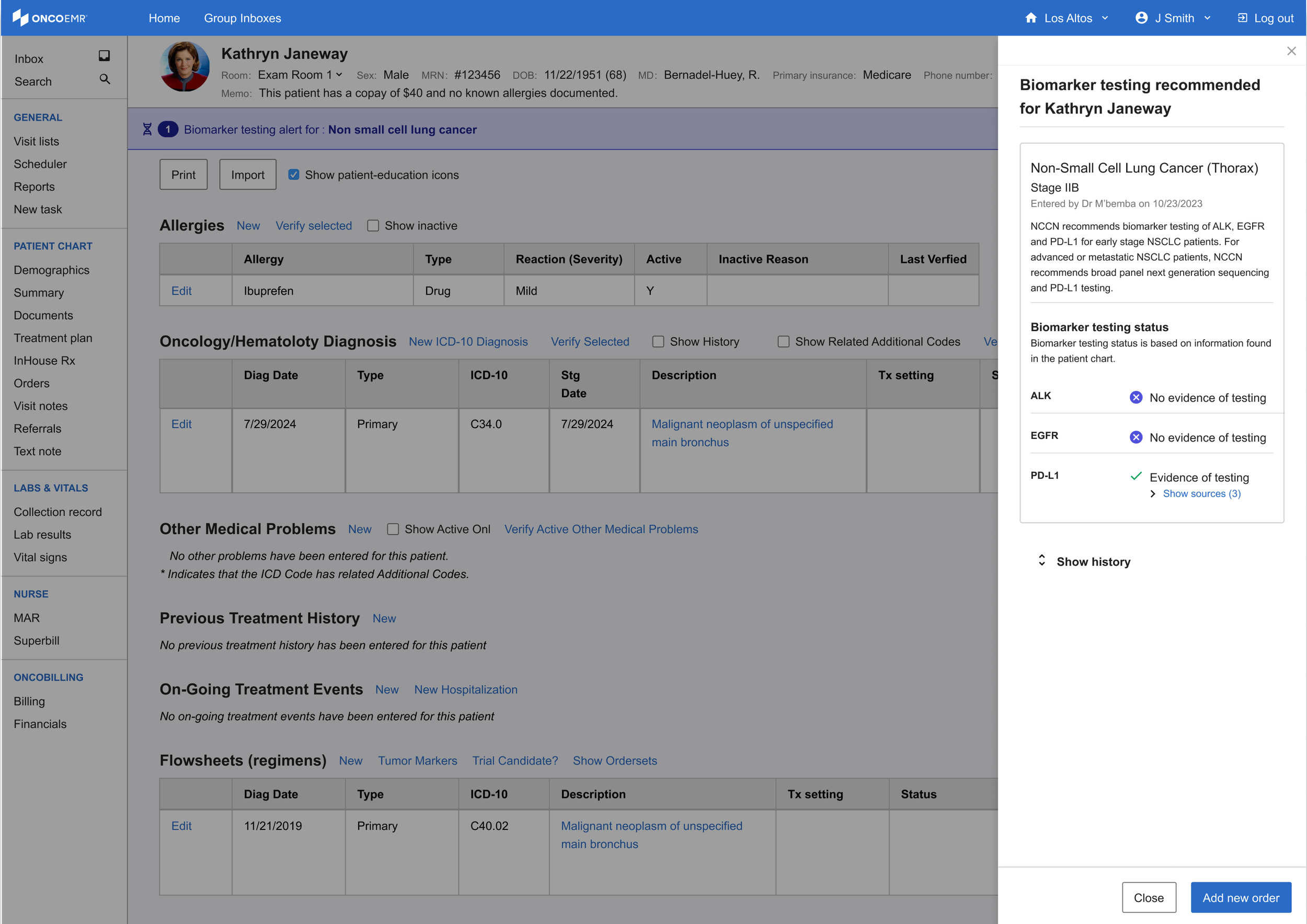
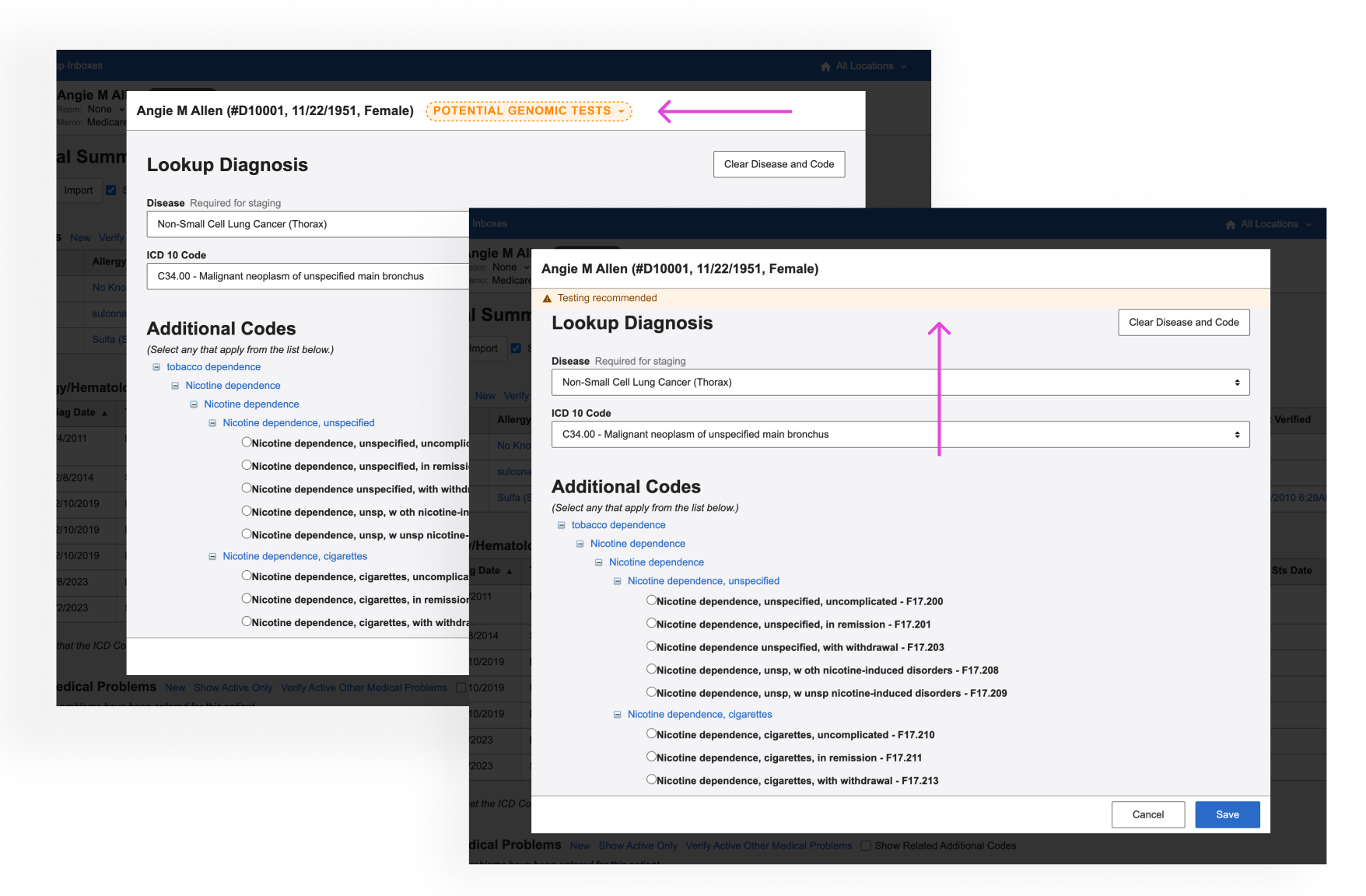
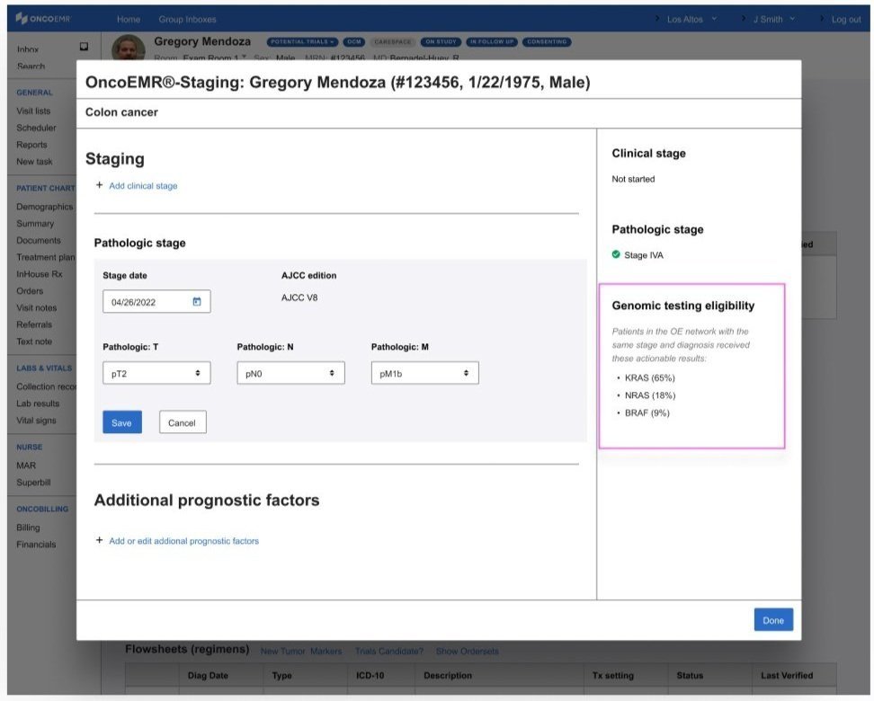
Bringing more information to the clinician's fingertips

One of the insights that came out of our interviews is that providers like having more information about eligibility before making their decision. The minimalist design of the alert banner doesn't allow for much detail, which is why I began to explore how we could put this information in other places that were equally accessible.
Drawing on existing patterns in our design system, I explored ways to bring detailed information about the eligibility criteria to the provider's fingertips. Short of creating a completely new page, the options with the most promise were a popover, a modal and a side bar.
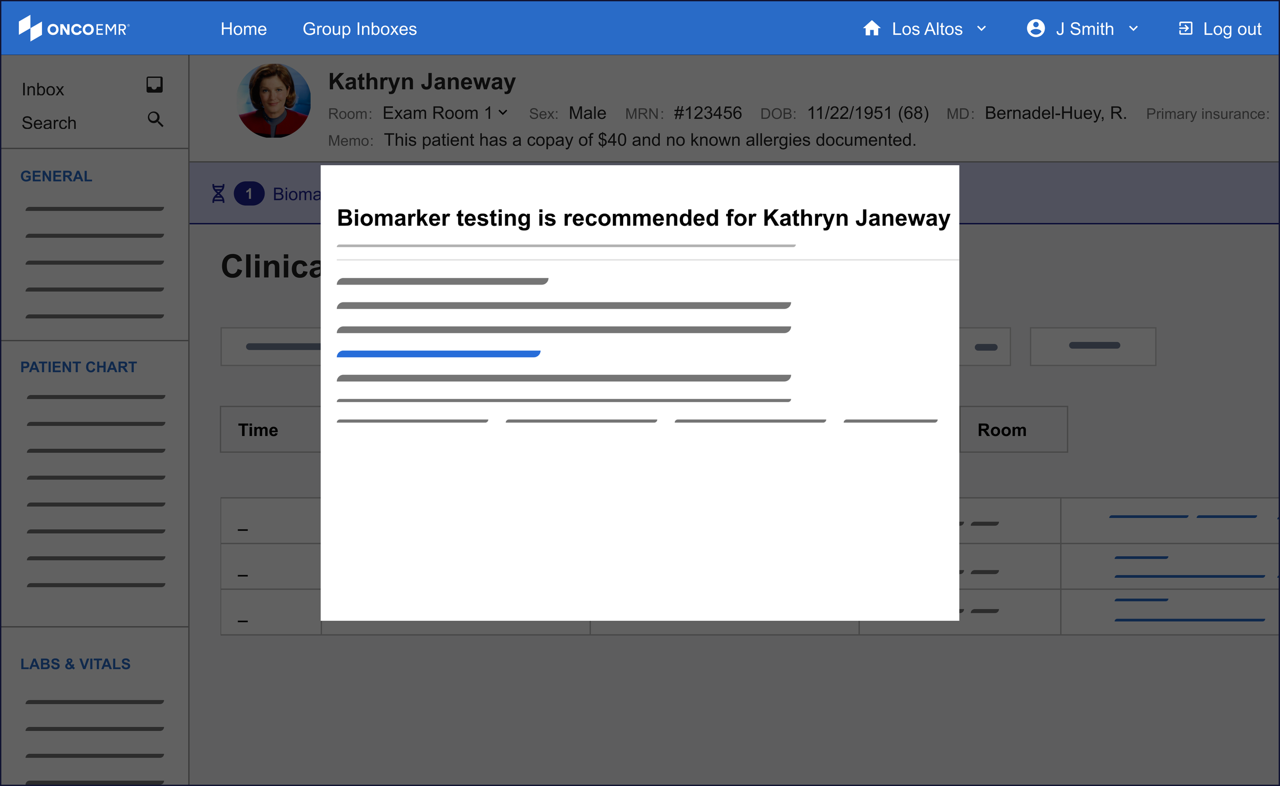
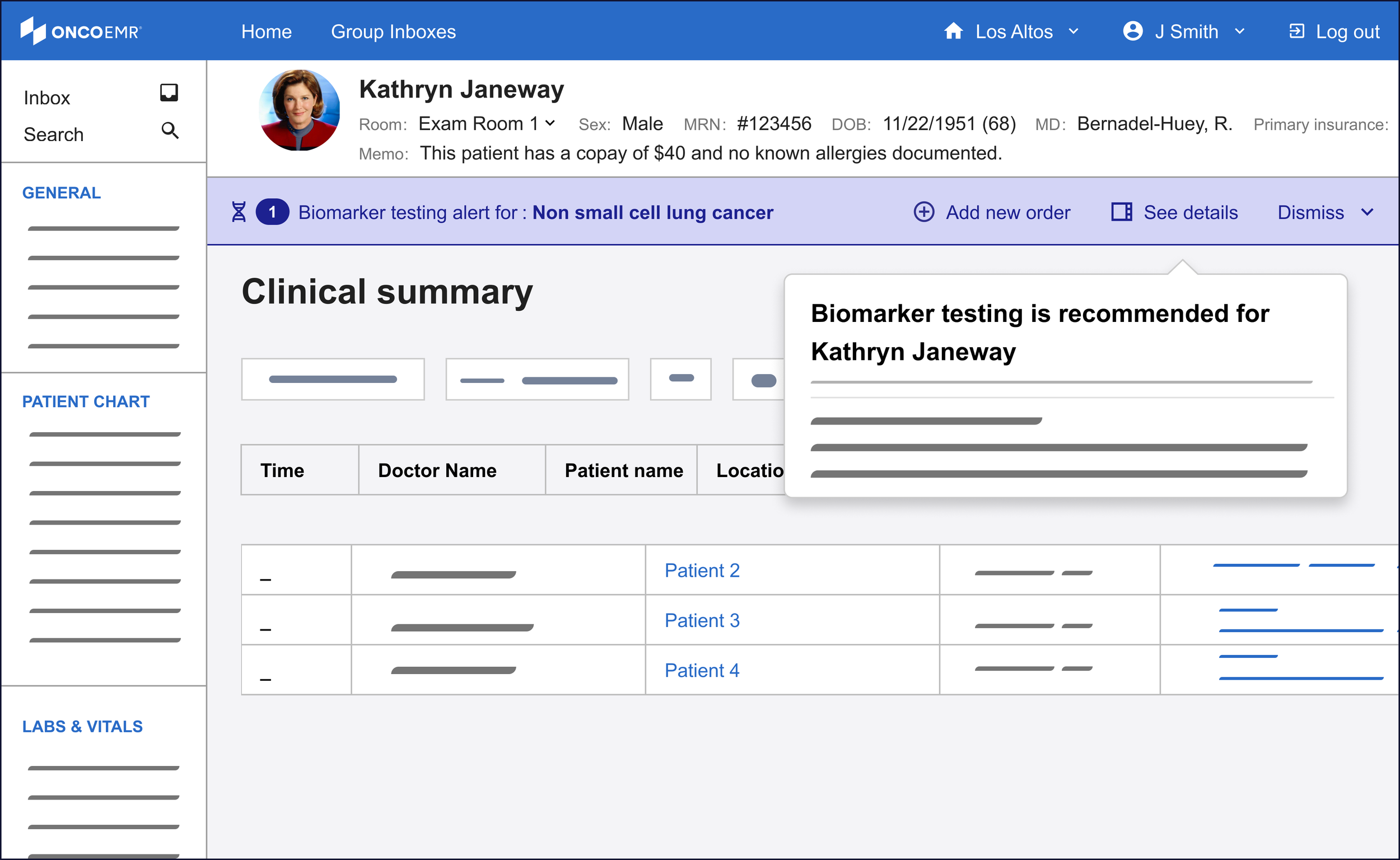
Of these three, the side bar was the most promising to me even though it was a nascent pattern for our design system. One of the principles I wanted to make sure to bring to this workflow was minimizing friction to maximize engagement. For the purposes of surfacing more information, this means the provider must not feel like their workflow is being interrupted by the information, but rather supported. The modal felt too much like an interruption to justify. While the popover was subtle and kept the user in the context of the workflow, the pattern proved hard to scale in the case of changing or expanding information.
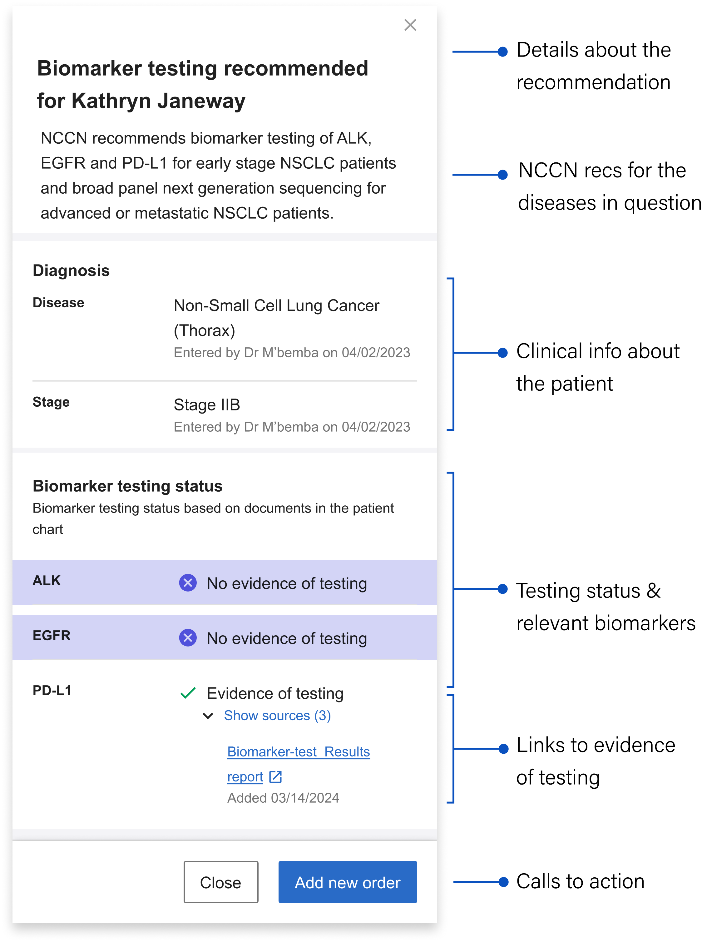
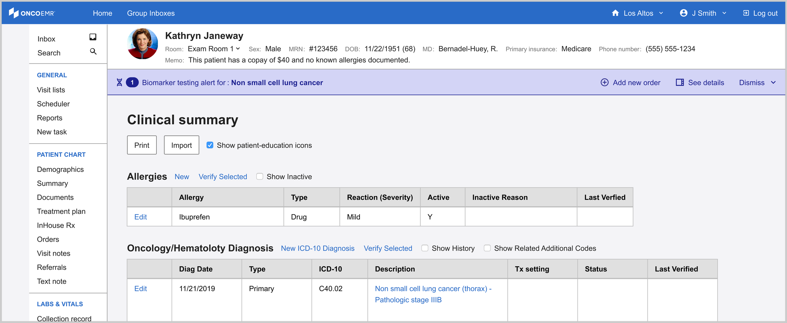
The sidebar's structure allows it to inherit a good deal of detailed information to take the weight off the banner alert. Still, in the interest of efficiency and reducing cognitive load, I worked with the clinical team to decide on what the bare minimum of information here was:
Details about the recommendation: Mirroring the language in the banner alert for continuity, including the patient's name
NCCN Recommendations: Language drawn directly from the gold standard guidelines that contain specific details about what the NCCN recommends for the particular patient’s case
Clinical information about the patient: Surfaces the relevant clinical info about the patient that qualifies them as part of the cohort we can generate recommendations for
Testing status and relevant biomarkers: Shows the biomarkers relevant to the patient’s stage and whether or not they’ve been tested
Links to evidence of testing: The source(s) of the information telling us the biomarker has been tested (if relevant) + the date it was last updated
Calls to action: Gives the user options about what they can do next
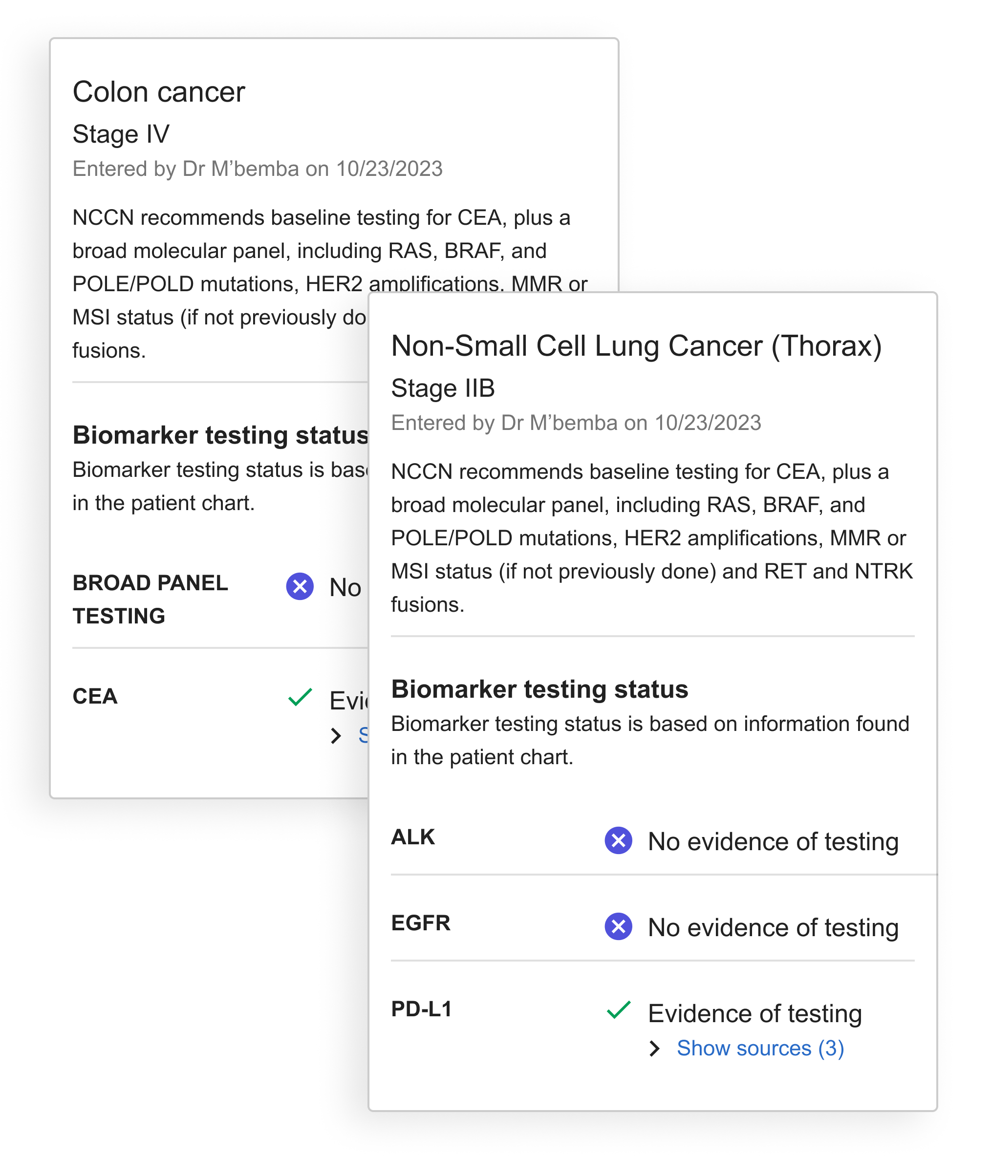
Designing for more than one disease
As development continued, we recognized the need to accommodate multiple diseases or bilateral diagnoses in our design. This required restructuring the sidebar to handle multiple alerts and testing recommendations. To organize this information clearly, I developed the diagnosis 'card' concept to visually separate recommendations by disease.
With the card, all information specific to the disease is contained within the boundary.
The final solution helps identify patients eligible for molecular profiling through an integrated alert system. A banner appears immediately in the patient chart after diagnosis, offering options to dismiss, order tests, or access detailed information via the sidebar. This streamlined decision support tool helps providers order appropriate tests at the right time, serving as an efficient yet powerful point-of-care assistant.
Launch
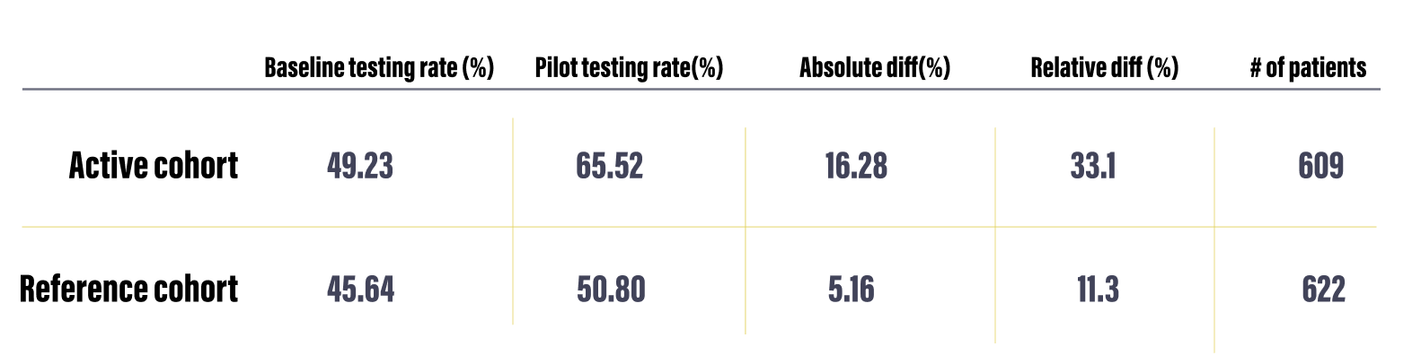
In April 2025 we launched the TDS intervention to 18 practices across our network representing 609 patients and 723 doctors. The Pilot duration was six months.

As part of the pilot we also had a control group of 12 practices chosen because they had similar sizes and testing rates as the active group. We used this reference group as well as the baseline testing rate of the active practices over the previous six months as reference points to measure the effectiveness of our intervention.
Determining Success
Our team determined that a statistically significant increase of testing over the course of the pilot was 12%. This determination was made by studying current testing rates for NSCLC and evaluating the impact of other studies that have attempted to improve testing rates.
In order to capture accurate baselines from which to measure, we took the average baseline testing rate for the 18 pilot practices during the six months prior to activating our alert and also tracked the testing rate of a reference cohort of practices. For this reference cohort, we aimed to achieve similar populations across all three groups in regards to number of patients and mix of practice size and makeup.
Key Performance Indicators
I worked closely with the PM, data insights expert and clinical lead to define 9 Key Performance Indicators (KPI’s) that would help us determine the success of the intervention. Some of these were clearly linked to product success metrics and engagement while others dealt with how the alert impacted testing rates overall.
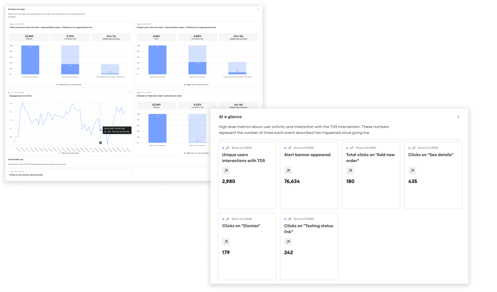
Fullstory dashboards tracking conversion funnels from seeing an alert to ordering a test and product health / engagement metrics
Data tracking
Once we had these in place, I partnered with our engineer to set up the appropriate piwik tagging so that we could follow the results in a Looker Dashboard. Simultaneously, I created a dashboard and segments in Fullstory that allowed us to watch user sessions and track engagement in real time.
Challenges
Despite having a robust strategy and several tools for capturing data, collecting the right information came with some challenges:
Inferring conversion: While the alert had a dedicated workflow for ordering a test that could be launched from engagement with it, we consistently saw many doctors using their more familiar workflows to order tests, even after seeing the alert. While we could draw a direct line to conversion for users that saw the alert —> launched the ordering workflow —> ordered a test from the alert itself, we could not technically do this for users who saw the alert —> ordered a test through a traditional workflow.
Mitigation: We used two metrics to illuminate conversion: One was direct (saw the alert—> ordered a test through the alert) and the other was indirect (saw the alert —> ordered a test within 24 hours of seeing the alert through a traditional workflow
Fullstory limitations: Due to limitations with our enterprise plan, we could not capture data from all 18 practices live on the alert. This meant that the Fullstory data was incomplete and that we would miss insights and session replays coming from certain practices.
Mitigation: I researched each practice and came up with a recommended sample list of practices I thought would best represent our cohort. We leaned on our data in the more comprehensive Looker dashboard for metrics and I positioned Fullstory more as a qualitative research tool than a source of truth for overall metrics. I used the segments and dashboards I set up to find relevant and interesting user playback sessions that would help us generate insights about usage.
Impact
The bottom line: Alerts at the point of care can increase testing rates
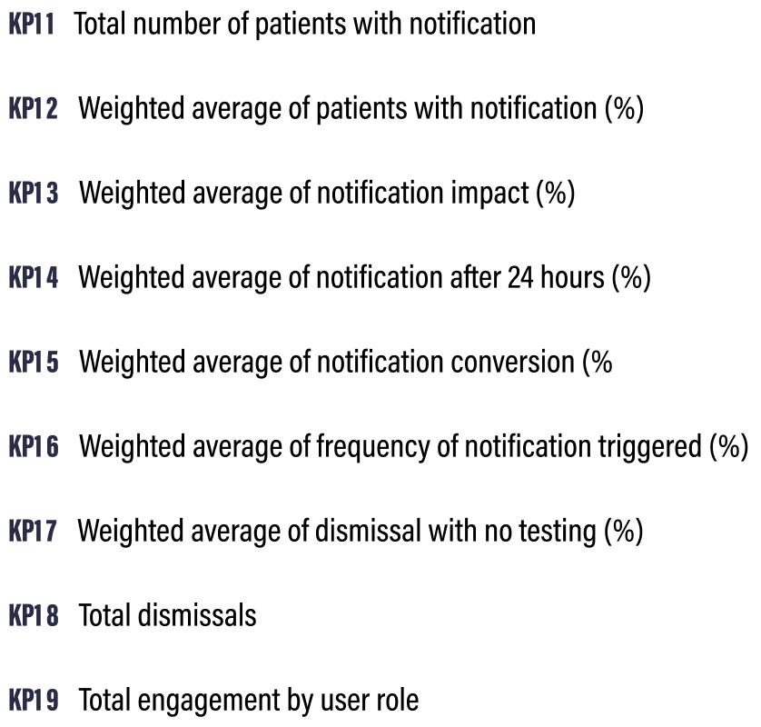
Over the course of the six-month pilot, 421 of the 609 patients that were impacted had an alert triggered on their chart indicating that they were eligible for testing. Across the 18 practices where these patients were being treated, we saw an increase in testing rates of 16.28% compared to the baseline and a 33.1% absolute increase, resulting in 99 additional patients receiving testing that may not have otherwise. This well outstripped our original goal of showing a 12% increase in testing rates.
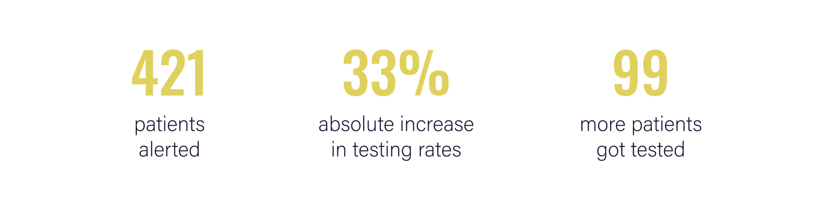
KPI Results
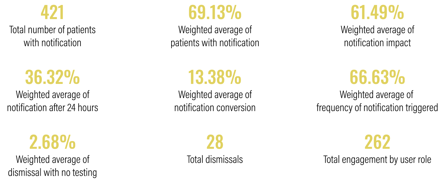
Over time
Testing rates from baseline and intervention periods, along with the absolute and relative differences and the patient volume.
The graphs below show the testing rate over the six month duration of the pilot for all 18 practices (left)* compared to a reference cohort of practices of similar sizes and with a similar baseline testing rate.
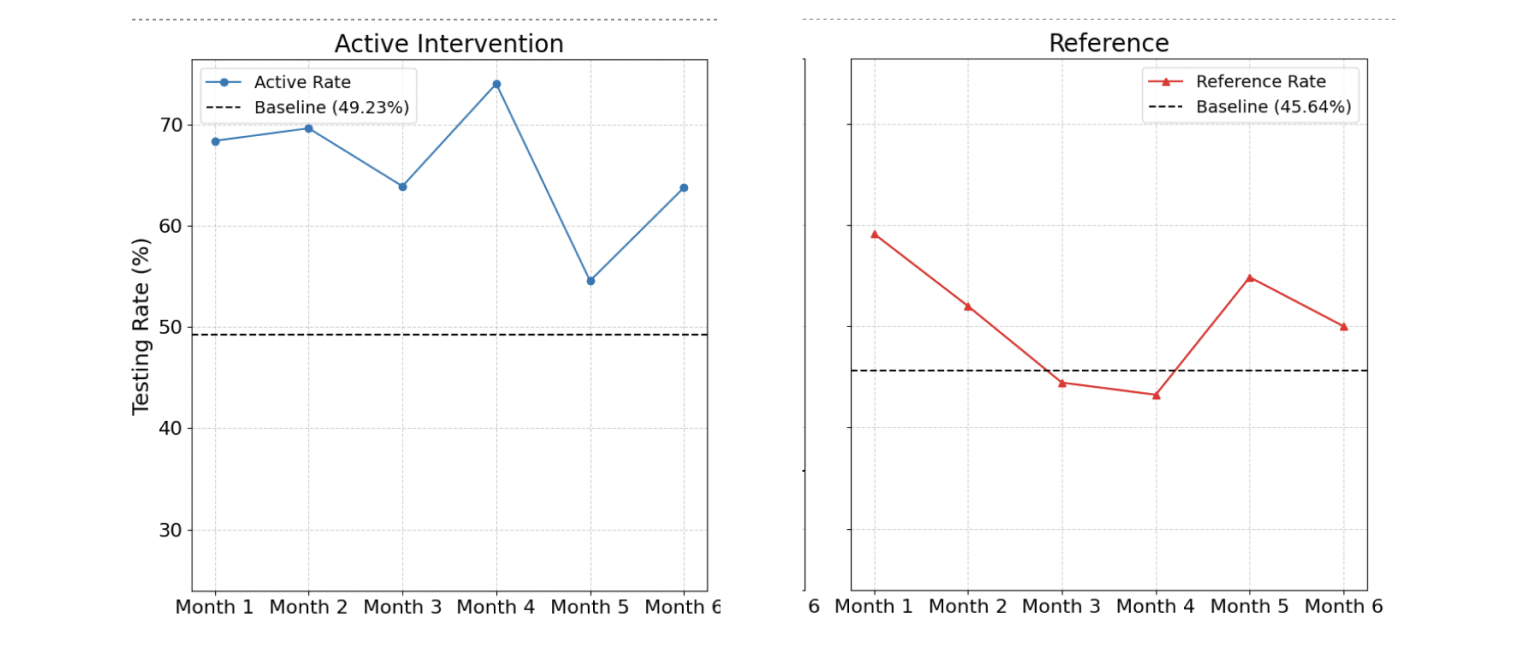
*We see a dip in month 5 due to a technical bug that reduced the number of alerts shown during that month.
Qualitative insights
I conducted post-pilot interviews with a handful of practices to understand their experiences and go beyond the numbers. Below are some of the most notable insights from these conversations.
-
The combination of an increase in overall testing rates and low engagement with the interactive components in the banner and drawer suggest the presence of the banner notification, rather than its interactive features, may be the most influential driver of behavior.
Approximately 86% of orders were placed using existing ordering workflows rather than engaging with the new ordering workflow in the intervention. This suggests that the established "muscle memory" is the default. -
The banner alert was designed to be subtle yet noticeable without causing interruption. Initially, practices reported a positive reception, with "no complaints from doctors." This suggests the banner notification successfully avoids "pop-up fatigue," a common issue that leads providers to ignore or reject similar interventions. However, other users found the banner and testing eligibility link too easy to overlook within their busy workflows.
It is important to find the balance between a notification that is noticeable, but does not block users from completing normal workflows and critical tasks.
-
Although the physician is responsible for the testing decisions and full management of patient orders, it's often the support team's responsibility to prepare the order and ensure the correct selections are made, including specific test add-ons or nuances based on insurance or practice preference. Their role requires them to have visibility into test eligibility information similar to the physician and the data in the drawer makes this more accessible, almost like a checklist.
-
Technical limitations with data processing resulted in some alerts being triggered for patients that already had testing. Inaccurate notifications frustrate teams and introduces caution when using the tool. While users told us they wanted to rely on the tool more, one or two inaccurate alerts reduced trust and likely hampered the impact of accurate notifications as well.