
Role: UX Designer & Strategist | Team: Freelance | Timeline: November 2020 -May 2021
Apothecary is a healthcare startup that seeks to revolutionize the way we search for, purchase and consume over the counter medication in a way that promotes both health and sustainability. With a focus on helping people find and receive the right medication for their symptoms, Apothecary’s mobile app puts the company’s curated online pharmacy at anyone’s fingertips.

Curiosity
Apothecary’s Business Model

Image property of Apothecary
The contents of your medicine cabinet isn’t something you typically think about until you’re already sick. By that point, navigating similar looking pills, dosages, expiration dates and varying levels of quality in your over the counter (OTC) medicine choices can mean the difference between staving off an illness and having to take a few days off work.
Apothecary re-envisions our relationship with our ‘at-home pharmacies’ by making it easier to find, get informed about and order OTC medication to your door by way of a curated, online pharmacy.
Medication arrives in re-usable glass bottles and refills ship in biodegradable pouches, significantly cutting down on plastic waste. (The pharmaceutical industry that generates ~ 190 billion plastic bottles every year).
Apothecary’s Mobile Experience
In order to reach more customers and make its services more widely available, Apothecary decided to invest in a mobile experience. I was brought on as a UX designer and strategist to translate Apothecary’s online experience to a mobile app and leverage mobile capabilities to maximize engagement with the platform.
Key Results for the Customer
Easy access to the online pharmacy store
A personalized experience
Proactive rather than reactive help
Key Results for the Business
Greater customer loyalty and engagement with the platform
Engage and capture new customers
More cross sell opportunities
More purchases
Creativity
Early ideas
When I entered the project, the team had identified three key features they wanted to include in MVP 1 as well as some early stage mock ups:

Search for and purchase medication from the online pharmacy

Scan the QR code that comes with the medication to register and view it in your ‘digital cabinet’

Receive symptoms-based medication recommendation
V1 Prototype Development
I built an end-to-end stage 1 prototype that encompassed and expanded on these three features with the intention of validating early hypotheses with user tests.

Search for and purchase medication from the online pharmacy
Onboarding and Dashboard
I created a ‘first time user experience’ (FTUX) flow in order to test our understanding of how users might enter the experience and discover the app’s core capabilities.
Apothecary’s online pharmacy was embedded into the dashboard experience, where users could search by what they needed or browse by category.

Scan the QR code that comes with the medication to register and view it in your ‘digital cabinet’
Scanning & The Digital Cabinet
I created a flow that simulated the process of scanning and viewing the new medication in the ‘digital cabinet’ so we could test the interaction with users.

Onboarding
The FTUX flow concisely explained who Apothecary was and how the platform worked

Scanning
Customers scan a QR code that comes with the medicine in order to digitally store and access important information about their medication from their phone

Dashboard
The dashboard prioritized the capability of getting help with symptoms by searching the online pharmacy

Digital Cabinet
The scan leads directly to a product page with specific information about the medication, expiration date and appropriate dosage.
The Digital Cabinet (Iterations)
I structured the information architecture for the ‘digital cabinet’ to emulate the experience of opening a real medicine cabinet: Survey all available medication on the shelf >> search by visual cues >> verify by reading the fine print. I iterated heavily on this design to improve the overall accessibility of the feature


Receive symptoms-based medication recommendation
Chatbot
To guide users to the right choice of medication, I designed a conceptual chatbot experience that gathered information about symptoms and made recommendations from the online pharmacy.
I took inspiration from experiences like Lemonade Insurance’s onboarding and other natural language chatbots like Cleo and Eno from Capital One.

Chatbot
Cabbie asks the user to input information that will help in making the best recommendation

Finding Meds
Cabbie guides users through the process of selecting the right medication for their needs, present and future
V1: User Tests

In-person user tests using the app, physical prototype and concurrent questioning
To test the stage 1 version of the app, I facilitated 7, in-depth, concurrent questioning Zoom interviews using the prototype and a research guide I developed.
While the app performed well in the test, the overall assessment was that the features highlighted in the V1 mobile experience didn’t afford enough differentiated value to redirect people from the website.
Additionally, scanning and registering medication in the digital cabinet was confusing and cumbersome for many users.

Concept by Apothecary for the refill process using their biodegradable medicine pouches and scannable QR code


A New Direction
I designed a new concept and proposed a pivot:
What if we engaged the user when they entered the app by simply asking them how they were feeling?
I argued that using this question as an entry point to the rest of the app's features would create differentiated value by taking a more human centered approach to helping people find the right medication.
V2: The New Experience
After getting buy-in, I designed the new experience to launch from the question ‘How are you feeling today?’ The result is a more natural and flexible way for users to engage with the platform and benefit from what Apothecary can offer.

Users are welcomed by an open question
If desired, users can share more information about themselves to receive a better recommendation for medication

Symptom input leads into one of Apothecary’s aspirational core capabilities: Suggesting the best medication for certain symptoms

In keeping with mental models for how people look for information in their physical cabinet, the 'digital cabinet’ elevates only critical information about medication
More information is located one click deeper

Users can input their symptoms


Users stay in the pipeline to order what they need


Or a desired medication

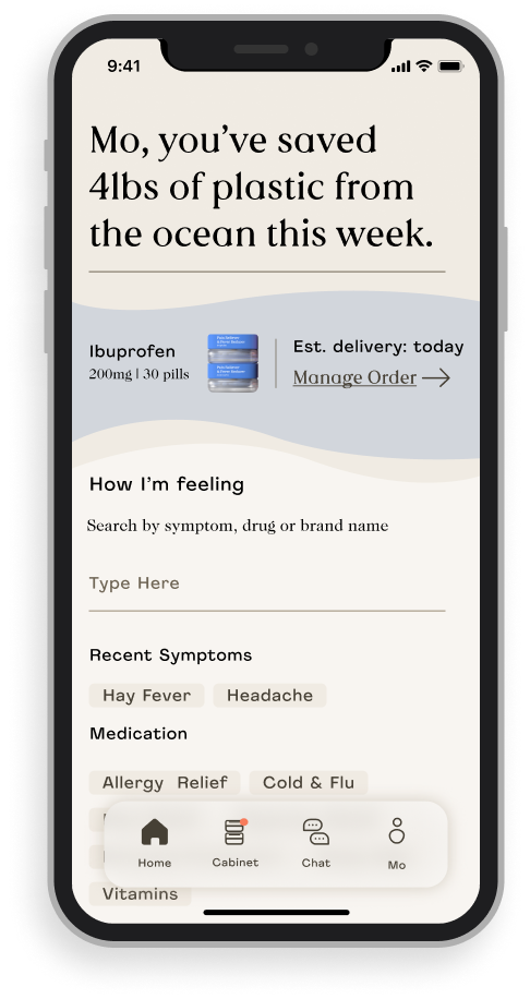
Based on their experience or status at any point in time, the dashboard changes dynamically to level relevant, personalized information
The ‘scan and register’ capability is repositioned as a tech-forward delightful experience for those who want to go a step further rather than a critical part of the user journey

Impact

Next Steps
This is an ongoing project: I handed off an end-to-end Figma prototype as well as a comprehensive testing guide for the V2 experience in May 2021. Apothecary is currently developing back end capabilities to support the development of their web and mobile app. Stay tuned.